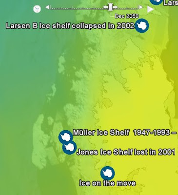
Climate Change on Google Earth

Now this is really cool--although, it may be a big time killer:
The British Antarctic Survey and the UK's Met Office have released a pair of new layers for Google Earth that depict the effects of climate change across a 3D map of the globe. In one fell swoop, this about doubles the amount of climate content that's easily accessible from the Google Earth Gallery and Showcase pages.
To check out the maps, download and install Google Earth, then click here to download and open the map file (in KML format) from BAS and here for the Met Office map. (If Google Earth doesn't run when you click those links, you'll have to run it yourself and open the KML files from the File menu.) They will load into the 'Places' bar on the left - checking boxes there displays the content.
Both maps make good use of the program's time-series tool: as you watch an animation or drag a slider, BAS shows Antarctic ice shelves receding over recent decades, and then the Met Office steps in with a color-coded overlay of expected future warming under a medium-emissions scenario. There are also 'push-pins' in both layers that, when clicked, pop up photos, videos and text on climate impacts around the world.
Read it all here.

Comments